

Expected Possession Goals GameFlow: Taking a Ride Into the Danger Zone
/By Jamon Moore (@jmoorequakes)
A few weeks ago, we introduced Expected Possession Goals (xPG) GameFlow, a visualization of the momentum of a soccer match from kickoff to final whistle of each game. xPG GameFlow uses the accumulation of Chance xPG to measure the strength of an opportunity for a team to get a shot. The higher the Chance xPG differential between the teams, the longer the bar for that minute for the team with the higher amount. Quite often goals are scored when the momentum bars on the xPG GameFlow chart are at their longest.
Many people have asked us, “what is the difference between xPG and xG?” or “how does xPG translate to xG or to goals?” To aid xPG GameFlow in answering questions such as “which team had the better chances?” and “when should a team have scored?”, we introduced a couple improvements after the first week of tweeting MLS game charts on @GameFlowxPG. I wanted to provide more context for these improvements and dive deeper into them.
Normalizing xPG for Game-to-game Comparison
People are used to looking at Expected Goals and understanding it relates to the number of goals a team probably should have scored in a particular game or over the course of a season. Chance xPG accumulates over the course of a game at a higher rate than xG because it measures the weighted value of every possession, whether or not it results in a shot, based on the xG value if a shot were to occur from the source location of every successful action such as a pass or dribble. However, the total Change xPG for each game was typically somewhere between eight and 12. This led to the question of “what is the total value on the xPG GameFlow graph trying to convey?” In reality, the value was only trying to convey which team had the more meaningful possession in aggregate. However, the question remained as whether a team’s xPG value was “good”, and in Twitter comments, we saw xPG confused with xG. Consider these two examples from the first week we posted xPG GameFlow charts:


The FC Dallas vs. Columbus match had an aggregate score of 11.7, while the Houston vs. Portland match had an aggregate score of 16.8. If you weren’t comparing these games side-by-side, other than one game having no goals and the other having five goals, you would probably not realize one had a much higher aggregate score than the other, as the bars in the graphs appear to be similar lengths. Also notice that the Y-axes on these graphs had variable values which made comparison difficult.
Along with locking the Y-axis, the solution we came up with is normalizing the xPG value displayed to 100. Every value over or under 100 indicates a percentage better or worse than the league average xPG accumulation per game.
Here are the same games with their score normalized to 100. Using this normalized score it is more clear that one game had a higher accumulation of chance than the other.

As you can see from these normalized scores, in the FC Dallas vs. Columbus match, both teams had a score less than 100, showing they were not generating the league average in chances. In the Houston vs. Portland match, both teams had a score over 100, showing they both created more chances than average.
Highway to the Danger Zone
After examining a couple weeks worth of games with xPG GameFlow, it become clear that people were interested in which situations a team was expected to score – i.e., how long did the bar need to be? We determined that there was an xPG per minute value where the chance became much better for a team. In case you are wondering why we chose to do this per minute rather than by per possession, goals often come in a situation where a team does not have continuous possession. A team may advance the ball into their attacking zone, only to lose it temporarily, have it cleared out of bounds or ping-pong around the box – but the pressure hasn’t ended. If they are able to win the ball back quickly, the opportunity is still there to keep the momentum and create a shot.
Eliot McKinley crunched the data and determined the Chance xPG per minute value where a team could reasonably be expected to score was around 0.44 for home teams and 0.42 for away teams. When a team passed this value, they crossed into the Danger Zone. We put out a poll of Kenny Loggins music choices and received the following feedback:
We then added pink Danger Zone areas for each team to every match graph, so it is clear how many times a team had such sustained pressure and momentum that a goal was most likely to occur. That’s different than saying a goal will be scored or even ought to be scored, but the chance was greatly increased. Here are the two games again with the full graph displayed:
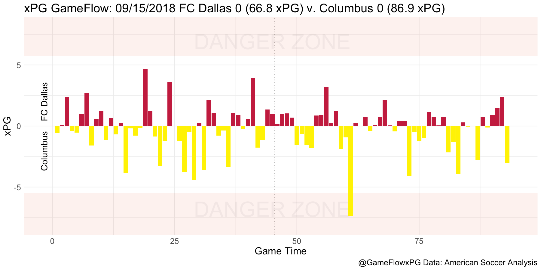

You can see only Columbus had a bar extending into the Danger Zone in the FC Dallas vs Columbus match, so it appears FC Dallas never threatened to score. If a goal had been scored, it probably would have come suddenly from long range, perhaps from a free kick. In the Houston vs Portland match, Houston made the Danger Zone six times, once with two consecutive minutes, scoring on three of these and again once outside the Danger Zone. Portland had two minutes enter the Danger Zone, though their only goal came by way of a 9th minute own goal.
Riding Into the Danger Zone
As of Week 32 in MLS, teams had made 1612 trips to the Danger Zone, scoring goals ~70% of the time. At this rate, when you consider that in the ASA xG model a goal right in front of the net is scored about ~44% of the time, that’s reasonably good accuracy. You can begin to use “Danger Zone trips” as a proxy for measuring how many goals a team could have scored in a match (considering xG is more “should have scored”) and how efficient they are scoring them in high-value situations.
Here is a comparison of Danger Zone trips to actual goals scored this season through Week 32:
Only one team has scored more goals than made Danger Zone trips – Montreal, although Real Salt Lake is close. This may indicate a high efficiency in the Danger Zone or it may be an indicator of other issues. In the case of these two teams, it’s an indicator that they score more goals from longer distances, precisely because of their ineffectiveness closer to the goal, as these shot and goal buckets show.
This is the breakdown of goals scored for each team based on the distance from goal. For example, 15% of Atlanta’s goals have come from inside six yards, and 2% have come from 30+ yards.
This is the breakdown of shots by each team based on the distance from goal. For example, 4% of the Red Bulls’ shots have come from 6 or fewer yards away, and 22% have come from 6-12 yards away.
These graphs also generally show MLS 2018 teams in the playoffs tend to both shoot more and score more closer to the goal than teams that aren’t.
But keep in mind that xPG – Chance xPG specifically – indicates the likelihood a shot will be made, not that a goal will be scored (although if a shot is taken, the xG of the shot is included in the possession). In other words, the analysis progression is from Chance xPG to shots (xG and Shot xPG) and from shots to goals. Consider this chart comparing Chance xPG won per minute to total shots:
The farther right the team is on the graph, the better the chance a quality shot can be taken, and the higher they are, the more shots they are actually taking. Teams such as Sporting KC and NYCFC are shooting a lot but not necessarily with the highest quality. Atlanta is easily the most efficient at getting a better quality shot, followed by (surprise?) Toronto. It’s metrics like this that have made Toronto feel for much of the season they could revert to 2017 form at any time, however in their case it is the defense and goalkeeping which has been hurting them, not their chance creation. Since shots can really occur at any time, Danger Zone trips somewhat shortcuts the analysis flow from Chance xPG to shots to goals by identifying the situations where the momentum is the highest and the best goal-scoring chances tend to happen.
As you can see here, Toronto gets the sixth most Danger Zone opportunities, but then also gives up the sixth most in the league.
Philadelphia, hidden mostly behind NYCFC here, has become one the best defenses in the league by limiting their opponent’s Danger Zone trips. They are the best in the league when at home.
Conclusion
xPG GameFlow may seem simple, but it contains many additional clues over the course of a season about a team’s performance from both the attacking and defending sides of the ball. By adding the xPG normalization, we can better see how the chances were for particular game compared to others. And with the new Danger Zone in the GameFlow graphs, we get a better sense for the scoring possibilities a particular game had based on strong momentum situations.
To see the GameFlow graphs and Danger Zone opportunities for MLS games, follow @GameFlowxPG on Twitter.