

Using Goals Added Subcategories for Player Evaluation
/By Paul Harvey, Mike Imburgio, Ben Bellman
Since it was introduced, Goals Added has been superior to most of the publicly available algorithmic rating systems, such as those provided by WhoScored, SofaScore, or Fotmob. The additional context of just how much each action is contributing to the likelihood of scoring provides more information than simply evaluating a player based on the number of certain actions (the value of those actions also weighted by a human being, introducing bias). Similarly, basing scoring on a known currency of goals is simply much more intuitive than some nebulous 0-10 rating scale.
The weakness of g+, similar to those models, is that it is relatively difficult to understand what a player was doing to gain and lose that value. With only 6 broad categories, trying to gain any particular insight as to what the specific actions players were doing was limited - and as demonstrated in the previous article, even the way actions were assigned was not always intuitive.
With the addition of the subcategories it becomes reasonable to directly compare players to see how they are gaining or losing value on the pitch. There’s a lot of reasons that stakeholders are drawn to analytics; teams want to gain an edge, players want to improve, and fans want to win arguments online. The g+ breakdown allows the conversation to go beyond “Player X is better than Player Y” and to move to “Player X adds more consistent value than Player Y by doing these specific things” and even “Player X might add more value via certain actions, but the team needs what Player Y brings more”.
Dashboard:
To enable these in depth comparisons, this article contains an up to date shiny app with all g+ Subcategories.
The Tableau dashboard here will not be updated as frequently as the Shiny app, if at all, but is accurate up to 7/1. There is a single player view, as well as a multi-player comparison. You can’t filter to a specific league for Tableau reasons, but that might be interesting as well. If you want to compare Darlington Nagbe to Denise O’Sullivan, you can do that.
If you want to play with the dashboard solo, head here.
What Makes an MVP:
As an illustration of how to use the subcategories, and the embedded tool, we can examine the Most Valuable Player race. Matt Doyle selected three players in his Midseason Awards column, which is a good place to start. To round it out with a fourth player, I’ll add Evander - a player who was in the race last year and is very much a contender this year despite not having quite the same performance in g+.
Overall g+
(Values as of 6/9/2025)

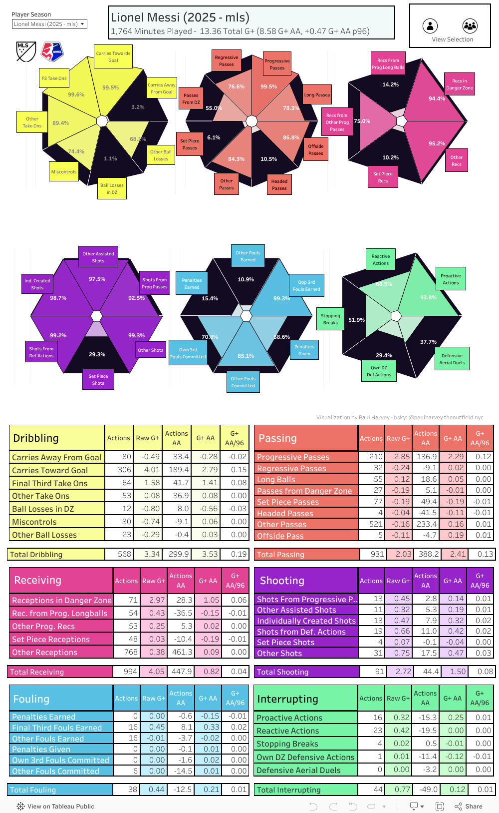
Looking at the four players together, Messi is clearly head and shoulders above the rest. He adds significant value in all on-ball categories, to the point that it is difficult to keep up. White and Evander are closer together, and Dreyer is the outlier from a negative point of view. Of course, +0.06 G+/96 is still a great return for any player, but when compared against the top of the league Dreyer doesn’t quite compare.
From the zoomed out view, White’s dribbling stands out as the most notable negative, while Messi’s passing alone is double the sum total of Dreyer’s total g+. Is it enough to say that Messi is a sublime passer and White is a poor dribbler? Of course not.
Into the Nitty Gritty
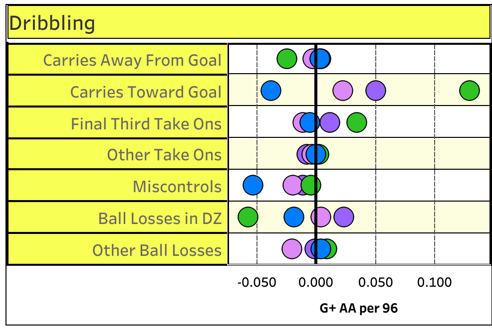
Blue: Brian White, Green: Lionel Messi, Pink: anders dreyer, purple: evander
First, let’s tackle the mystery of Brian White’s dribbling. The subcategories Carries Towards Goal and Miscontrols stand out as the bulk of the contribution to the -0.11 Dribbling G+ AA. It would therefore stand to reason that White carries towards goal significantly less, and loses the ball significantly more by failing to control a pass.
The latter statement isn’t true, though. Of the four player sample, White is actually 2nd lowest in total miscontrols per game with 1.8. Evander is the loosest receiving the ball, losing it twice per game. What that implies is that on a per action basis, White is losing much more value per miscontrol. That is almost certainly because his miscontrols are in high danger situations, built up in the possession prior. This tracks, given the whole playing striker thing, compared to the others here.
Messi’s performance in Carries Towards Goal is notable as well, as he doubles up the next closest player here. On a per action basis, they are similar, but Messi carries the ball at incredible volume.
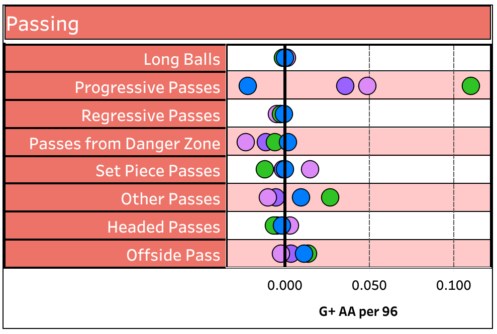
Blue: Brian White, Green: Lionel Messi, Pink: anders dreyer, purple: evander
Speaking of incredible volume - Messi also doubles the field in his ability to pass the ball progressively. He’s at more than 8 progressive passes above average per 96, and it pays off. Compared to his progressive passing, everything other metric fades into the background. Andres Dreyer’s performance here is interesting - he scores highly on progressive passes, but when he is in the danger zone he loses more value than any other player (on more attempts than any of the other players).
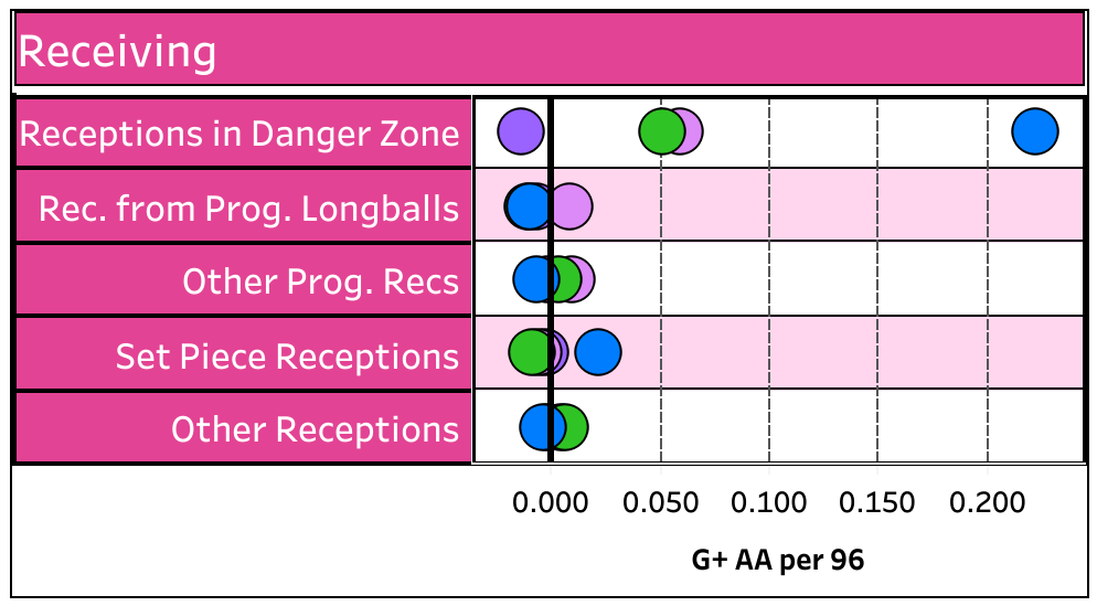
Blue: Brian White, Green: Lionel Messi, Pink: anders dreyer, purple: evander
Of course, receiving is where Brian White truly shines. He is at quadruple the value provided above average for Receptions in the Danger Zone, and of course strikers rack up the receiving G+ on average. Despite that, he curiously is not the highest in total receptions in the danger zone. That’s Messi. There could be a couple reasons for that; Messi might be getting a number of low risk handoffs close to goal that have little impact to receiving G+. White’s receptions might generally be significantly closer to the goal than Messi’s. Either way, White’s quality vs quantity approach gives him a comfortable lead here.
With the three most important categories broken down, who is the Most Valuable Player? On a goals added basis it’s Messi, and that’s probably fair; he dominates in two of the three most important subcategories and is second in the third. How about the other three? How do you value three distinct approaches to the game? White is the highest risk vs reward, doing most of his work in the highest danger areas and racking up receiving value while losing it on the other on ball actions. Dreyer is a bit of a middle ground, playing a high number of dangerous balls but not operating in the same areas as White. Evander is the biggest outsider, receiving about the average number of touches in the danger zone but also losing the least value via miscontrols, bad dribbles, or passes. Whichever player is truly the most valuable might depend on the context in which they play.
Going Further
One of the best questions about any metric is just how much it helps us predict the future. By breaking up g+ into a multitude of component parts, it may be possible to demonstrate that a few particular areas are most reliable and most indicative of player value over future performances. While we have not fully explored which subcategories are the most reliable that could be an area for future research.
Another important question is development curves for players. We know, generally speaking, that players improve over the first part of their careers before levelling off and then eventually declining in their 30’s. It would be interesting to study how players tend to develop - whether it is a gradual lift in all areas, or if certain areas drive most of the improvement. Also, identifying which subcategories are a strong signal for future player success can make the murky world of young player recruitment more clear. With the growth of data availability for youth focused leagues like MLS Next Pro or the USL Super League, that would provide a stronger foundation for American teams trying to identify the next wave of talent.
Another unexplored area in Goals Added in general is the relationship with risk and value. A good real life example is the partnership of Darlington Nagbe and Aidan Morris in the Columbus Crew midfield. Both players received a great deal of public acclaim as they played far up the field and spent enormous time on the ball, but their actions were routinely dinged by the g+ accounting and they ended up negative compared to their midfield peers. This could be driven by a general risk averse approach to possession play; both players were among the highest in xPass %, representing low risk passes as an outsized part of their game. Subcategories can help break down those choices further to see if there is a missing piece to the calculation.
Last, these categories are our attempt at slicing g+ value into discrete parts to make ratings more transparent. This, of course, can be done in a number of different ways. Future divisions could be directed toward a more objective validation method, although this depends on the specific goal for which the subcategories would be used. Team-level divisions would be similarly useful, but might require a different lens. Directing a division of actions toward a specific game model could guide decisions and aid recruitment and performance evaluation in a way that’s tailored towards that specific game model, too. That said, helping facilitate transparency in performance metrics is always useful, and we’re looking forward to seeing what we can learn with the subcategories outlined here.
Editor’s note: the shiny app is a smidge too wide for squarespace’s liking when you view both g+ and # of actions. Pick one, or head here for the app.