Hopefully most of you read Part I of my series on Expected Wins in Major League Soccer.
As a quick reminder the Expected Wins analysis is my internal data quality review on the seven data points I use to support my quantitative Possession with Purpose analysis; the stronger the correlation these data points have the more confidence I have in the overall Indices that are created to assess team performance.
For your benefit, in case you forgot, here are the seven data points I continue to analyze as we reach the 92 game point in MLS; which equals 184 events:
- Passes Attempted Entire Pitch
- Passes Completed Entire Pitch
- Passes Attempted Final Third
- Passes Completed Final Third
- Shots Taken
- Shots on Goal
- Goals Scored
All data points, at this time, have equal weight.
What is interesting is that over the week to week course of the season 40% (20/50) of the weekly top five teams, in Attacking PWP, have averaged less than 50% possession in their matches.
For me that's pretty cool as it indicates this analysis is not really biased towards teams that use a shorter-passing scheme in attack. Week 5, 3 of 5 teams were under 50% and the other two were both under 51% possession.
Some of those teams are possession based teams like DC United, Portland and Seattle but in that week the margin of possession did not have as much effect as the ability of those teams to finish quality chances - the top three teams that week all scored goals equal to their shots on goal.
The five teams that week who exceeded 80% in Passing Accuracy; usually a good indicator of ground based attacking all finished outside the top 5.
Moving on after that tidbit, here's the averages for overall (blue bar), teams that win (green bar), teams that draw (orange bar) and teams that lose (red bar).
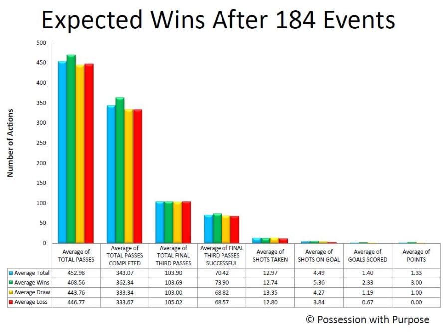
Facts as they exist today after 184 Events in 2014:
- The overall tenor of the data points and their relationship really hasn't changed that much since XpW 1.
- Teams that win average 51.11% Possession; losing teams average 48.89% Possession, (lower)
- Teams that win average 76.39% in Passing Accuracy; losing teams average 74.10% (lower)
- Teams that win average 20.48% Penetration in the Final Third based upon Total Passes completed; teams that lose average 20.32% (lower)
- Teams that win average 18.64% Shots Taken per pass completed in the Final Third, losing teams average 19.22% (higher)
- Teams that win average 42.67% Shots on Goal per Shot Taken; teams that lose 32.13% (lower) (by over 10%!)
- Teams that win average 46.18 Goals Scored per Shot on Goal; losing teams 17.03% (lower) (by over 29%!)
Like after XpW 1 (102 Events - 51 games) losing teams shoot the ball more often, on average, but are less accurate when it comes to putting those shots on target and into the net. Patience in creating quality continues to outweigh quantity...
Overall, the averages for Shots on Goal for winning teams has increased from XpW 1 (4.90) to XpW 2 (5.36); basically the better teams have gotten better and the losing teams have gotten worse (3.84 now) versus (4.10 in XpW 1).
I wonder how that trend will continue through the rest of this year?
Tthe 2% gap in Passing Accuracy between winning teams and losing teams has held from XpW 1 to XpW 2.
The gap in Shots on Goal has increased in losing teams to 10% as opposed to 9% (XpW 1).
The gap in Goals scored has remained near steady at roughly ~30%; though slightly smaller in XpW 2.
Losing teams still continue to take more Shots than winning teams; 12.74 (winning teams) to 12.80 (losing teams) but... that gap has dropped since XpW 1 - perhaps losing teams are looking to be more patient in their shot selection?
So how does the overall data relate in an Exponential Relationship?
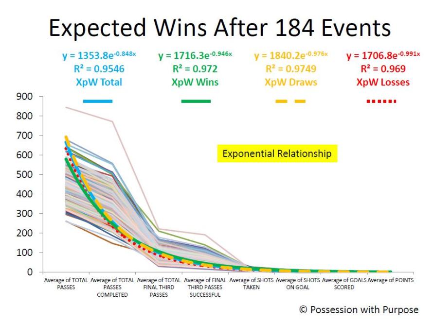
Observations:
The light shaded lines are the lines of data as in XpW 1 - and the trend-line colors remain the same.
This time the R2 has dropped just a tad.98 to .95 - all things considered most would consider that correlation Rock Solid... I do - and the correlation of these data points, viewed as a whole, have a higher correlation together than Goal Differential (R2 = .88) to Points in the League Table.
Goal differential is usually a great indicator but it also remains a qualitative statistical indicator not a quantitative indicator.
Like last time there remains a difference in the R2 between winning teams, teams that draw, and losing teams; with draws now having greater correlation than wins. Why? I'm not sure - but as noted by the closeness of all the data points there still remains a fine line between winning, losing and drawing.
Last time I felt that helped explain the difference between mistakes or unlucky breaks - I continue to sense that is the main difference. So might this be an indicator of luck - I don't know - what do you think?
I have seen discussions of late, on Telly, and in some articles written elsewhere, that focus more on 'space available' as opposed to just Shots Taken... hopefully that trend continues!
I also remain hopeful that OPTA and other statistical web sites will offer up more critical events taking place in the Final Third... One other article written since XpW 1 is my analysis (as promised in Xpw 1) on defensive indicators; here's a link to Hurried Passes and those details.
In closing:
I still don't have enough data, in my opinion, to offer additional thoughts on individual team performance relative to home and away games; that probably won't have statistical reliability until the midpoint of the season (game 323 - events # 646).
There are trends but I'll save that for another article, enough for now.
Best, Chris