The Chicago Fire and Goal Mouth Data

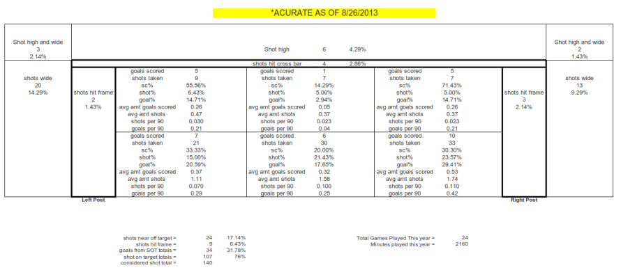
This is merely a trial run. I say that because in the last two days I've limited the collection of data and then expanded it. It comes down to how it tickles my fancy. The data I have collected is limited for the time being to the Chicago Fire as just a means of comparing a club and its data to the league and trying to make sense of it. This hopefully will develop into the means of how I can some how attribute value to clubs and their keepers in the future. Below is a picture of the goal mouth, and the data has been collected from the website Sqwuaka.com. Coupled with a previously built image, you can see how Chicago compares to the rest of the league and how a majority of their goals have been scored this season. While numbers are always an important thing, remember that it's more about ratios and the average occurrence than pure accumulation at this juncture. Not all teams have played the same amount of games and they haven't had the same opportunities.  Shots+Goals and visuals

ChicagoFireHUD

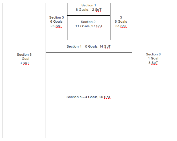
In addition to the Goal Mouth visual, here is a field map diagram as it applies to the dimension of the field. This has already been provided in raw form in the data that Matty has collected and posted in the raw shot data tab, but I wanted to have another visual to compare the above data.

ChicagoFire-ShotField

The problem between the two is that there is no correlation between the fact that Chicago has allowed 4 goals in section 5 to the fact that they've also allowed 5 goals in SoT1 (for ease of the tally, I gave a numerical designation to each location on the goal mouth; starting at the top and working left to right). This is the next collaborative effort that I'm working on, gathering both the shot location of origin and placement on the goal, and from what specific individual at what time.

This is a very time-intensive task and it'll probably take me the rest of the week to complete it just for Chicago. However, I'm taking suggestions on how I could compile this data without hand jamming it into a flat file. An SQL dump of the current Opta database for the season would go a long ways to helping compile this data and would be nice. But I'm never above a bit of hard work.

Thoughts?

A Visual Look At Shots On Target

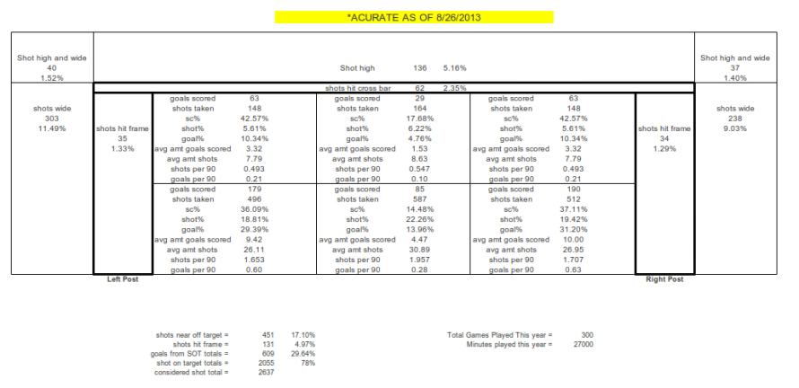
This is part of my efforts to try to come up with a zone rating of sorts for goal keepers. The problem I'm running into at the moment is trying to find visual information for shots against. If I want to know how good Dan Kennedy was preventing goals against Columbus in week 1, I have to go to Columbus' page on Squawka and narrow the shot data to that specific game. Basically, It just boils down to more time digging than I initially planned to devote. Quickly, here is a visual graphic that I made with the help of Excel. I know it's not really pretty, but it delivers the data in the manner in which I needed it without getting caught up on eccentric details, details with which I often spend too much time meddling. Shots+Goals and visuals

There isn't a lot that this immediately tells you, of course. It's more of a jumping off point to start comparing data once it is collected. That's where the next effort is going to be headed. Who are the teams that are above league average and below league average? Are they bleeding low percentage goals, or are they being beat in an unusual zone? This information, while still miles from being complete, moves us in the right direction of knowing more about shots and goals than what we did previously.

You'll notice that I also included shots that are wide but still close to the post. I'm curious as to whether these shots numbers become inflated when playing teams with "better keepers". Unfortunately we need to define what better is. Better than what, exactly? I'm not sure. Again, parameters haven't been set, and data sets are still being gathered.

This is a fun exercise and one that should, if nothing else, provide us with some excellent insight to teams and their seasons at this point.

Comparing Goalkeepers to Pitchers

Cruising around twitter is about the most social I get nowadays. It sounds nerdy, and really it is, but it's amazing the amount of material that you can discover---not to mention the 140-character conversations you can have---produced by people smarter than me. Looking around, I stumbled across an article that dates back about 10 days from the site 'Bring On The Stats' by the anonymous author Chase H (aka @chaser_racer32 on twitter). Chase H, goes into a good post about how Sporting Kansas City's goal keeper, Jimmy Neilsen, is---probably gradually---headed for the decline. He comes to this conclusion by going through save% and shots against per minute. A pretty good tactic that has some good reasoning.

"The table above is sorted by save %, which is pretty self-explanatory; it’s the percentage of shots saved by the keeper. Nielsen has the third-worse save % of all goalkeepers with more than 1400 minutes played. The perfect example of why wins and shutouts are not the best measures for a goalkeeper is the fact that Chivas USA keeper Dan Kennedy has saved a higher percentage of shots than Nielsen, and yet has only recorded 2 shutouts, and the team only has 4 wins. Kennedy has the misfortune of playing for one of the worst teams in the MLS, and he has faced almost 50 more shots than Jimmy Nielsen.

On the flip side, one can argue that because the defense plays so well, generally only the most quality shots make it on goal from the opponent. I do acknowledge that is a very big issue to this study, but to compare Neilsen’s stats from last season with the same defense, we see he saved 74% of the shots he faced while the defense conceded almost exactly the same numbers of shots per minute he played."

I'm pretty sure I've seen the analogy of baseball pitchers compared to goal keepers before---if not from some random person or thing I read, then certainly from Matthias. The point of the comparison being that neither the goalkeeper nor the pitcher really has as much influence on goals allowed or runs scored against them as a lot of traditionalists and general fans believe.

In fact, baseball created an individual stat to track exactly what a pitcher controls, and Fangraphs grades him solely on that stat, "FIP." The stat has been well-documented and was introduced to the general public by writers much more skilled than myself.

Back in the early 2000s, research by Voros McCracken revealed that the amount of balls that fall in for hits against pitchers do not correlate well across seasons. In other words, pitchers have little control over balls in play. McCracken outlined a better way to assess a pitcher’s talent level by looking at results a pitcher can control: strikeouts, walks, hit by pitches, and homeruns.

Finding some reading material on FIP today, and thinking about our podcast about the possibility of whether keepers influence shots on target, sparked some thoughts following the article by Chase H.

The idea of keepers being analogous to pitchers is all well and good. There are certainly some similarities. The problem I'm starting to have, though, is that there may be a better way of looking at it. Pitchers, while minimally, still control aspects of their performance such as ground ball and fly ball rates, strikeouts and walks. Keepers potentially could influence opponents psychologically, but truly the only physical effect they have at their disposal, prior to the shot, is their positioning. Positioning frequently corresponds to the defensive placement of a keeper's teammates and the opposition that controls possession.

This isn't the quiet like-to-like thinking that most jump into. However, I started reading about another baseball statistic and it made me think...

One of the differences between UZR and linear weights is that with UZR, the amount of credit that the fielder receives on each play---positive (if he makes an out) or negative (if he allows a hit or an ROE)---depends on how often that particular kind of batted ball, in terms of its location, speed and several other factors, is fielded by an average fielder at the same position. With offensive linear weights, if a batted ball is a hit or an out, the credit that the batter receives is not dependent on where or how hard the ball was hit, or any other parameters.

Maybe, we (and by we, I mean me) are looking at keepers the wrong way. Just like assuming that keepers have control over wins, shutouts and the like, is it any more responsible to assume that goals scored against them are purely their fault either? I'm talking about save percentage here.

To test this Keeper UZR out, we need to create set of guidelines in the same manner as what has been set out for UZR. There is also the key dependency that we don't have 6 years worth of data to work from. We barely have3 years of chalkboard data, and if using WhoScored or Squawka, we have even less than that.

The other problem is that we don't know the speed of the shot, and getting the angle of the shot isn't necessarily easy either. Not that it's particularly important. My goal this week is to take the shot data by Squawka and put together a visual representation of the six prominent scoring locations complete with shots saved data associated.

goalsscoredagainstSSFC

The first thing we need to establish is what are the areas shots are saved the least and how good keepers are at limiting goals they should. This seems rather silly, as I'm sure we can probably already theorize the likely goal-scoring locales as being the outside marks near the post. However, we still need numbers and we still need to know how good teams are at preventing goals that they often should.

Controlling for difficulty of shot on target by location on the frame at least starts to give us an intelligent understanding of what goal keepers are doing right and what they are doing wrong.
ASA Podcast XIX: The one where we talk ad nauseam about Landon Donovan

Okay, so Drew came up lame with a sore throat, leaving Matty and I to fend for ourselves and sending the podcast into a downward dive/30-minute discussion about Landon Donovan. We follow that up with another 30-minute discussion about the CONCACAF Champions League (CCL). At some point, in perhaps a show of solidarity or more likely a show of that pessimism that could come only from a couple of Mariners fans, we projected good things for each other's club. I for Portland, and Matty for Seattle.

Despite advertising a 2nd segment as a discussion about MLS front office personnel decisions---regarding past players and whether or not we'll see any future Ivy League day traders being hired into technical director positions---we had to cut the segment from the podcast due to mass overages in the first segment. We hope to pick up the nerds-vs.-jocks  talk next week.

This is one of our longest running podcasts at 70 minutes, but it's still a good one.  I hope you enjoy!

[audio http://americansocceranalysis.files.wordpress.com/2013/08/asa-episode-xviiii.mp3]

ASA Podcast XVIII: The One Where We Discuss Defense Influencing Shots

Family in town, waiting out this baby and being home doing nothing sure has made me lazy. So lazy that I really didn't get around to editing this and putting it together until last night. My apologies for the late posting. This week we discuss the USMNT and their romp in eastern Europe, a bit about Montreal and Omar Gonzalez. Then we transition to some discussion about whether goal keepers can influence shots on target. It's all some interesting stuff with a lot of giggling by me because I coined a new nickname for Drew.


[audio http://americansocceranalysis.files.wordpress.com/2013/08/asa-episode-xviii.mp3]

Noisy Finishing Rates

As a supplement to the stabilization analysis I did last week, I wanted to add the self-predictive powers of finishing rates—basically soccer’s shooting percentage. Team finishing rates can be found both on our MLS Tables and in our Shot Locations analysis, so it would be nice to know if we can trust them. Last week I split the 2012 and 2013 seasons in half and assessed the simple linear relationships for various statistics between the two halves of each season across all 19 teams. Now I have 2011 data, and we can have even more fun. I included bivariate data from both 2011 and 2012 together, leaving out 2013 since it is not over yet. It is important to note that I am not looking across seasons, only within seasons. To the results!

Stat Correlation Pvalue
Points

0.438

0.7%

Total Attempts

0.397

1.5%

Blocked Shots

0.372

2.3%

Shots on Goal

0.297

7.4%

Goals

0.261

11.9%

Shots off Goal

0.144

39.5%

Finishing

0.109

52.1%

Surprisingly, to me at least, a team’s points earned has been the most stable statistic in MLS (by my linear definition of stability). Not so surprising to me was that total attempts is also one of the most stable. Look down at the very bottom, and you’ll find finishing rates. Check out the graph below:

 Finishing Rates Stabilization 2011-2012

Some teams finish really well early in the season, then flop. Others finish poorly, then turn it on. But there’s no obvious to pattern that would allow us to predict second-half finishing rates. In fact, the best prediction for any given team would be to suggest that they will regress to league average, which is exactly what our Luck Table does. It regresses all teams’ finishing rates in each zone back to league averages, then calculates an expected goal differential.

On a side note, you might be asking yourself why I don't just use points to predict points. Because this: while the correlation between first-half and second-half points is about 0.438, the correlation between first-half attempts ratios and second-half points is slightly stronger at 0.480. Also, in a multiple regression model where I let both first-half attempts ratio and first-half points duke it out, first-half attempts ratio edges out points for winner of the predictor trophy.

Estimate Std. Error T-stat P-value
Intercept 1.7019 5.97 0.285 77.7%
AttRatio 13.7067 6.32 2.17 3.7%
Points 0.3262 0.19 1.691 10.0%

And since this is a post about finishing rates...

Estimate Std. Error T-stat P-value
Intercept -2.243 7.75 -0.29 77.4%
AttRatio 18.570 5.71 3.26 0.3%
Finishing% 63.743 50.08 1.27 21.2%

A good prediction model (on which we are working) will include more than just a team's attempts ratio, but for now, it is king of the team statistics.

Signal and Noise in MLS

Some Nate Silver guy wrote a whole book about "signal" and "noise" in data, so it must be important, right? Sports produce a lot of statistics, and it turns out that some of those statistics are pretty meaningless---that is, pretty noisy. A pitcher's ERA is sitting below 3.00 after eight starts, but he has more walks than strikeouts. Baseball sabermetricians will tell you that the low ERA is mostly noise, but that the high walk rate is a signal for impending doom. An MLS team leads the league in points per match, but it allows more shots than it earns for itself (note: this team is called "Montreal Impact"). Soccer nerds like me will tell you that its position in the standings is mostly noise, and that its low shots ratio is a signal for impending doom---or something worse than first place, anyway.

The reasoning behind both examples above is basically the same. Pitchers' ERAs, like soccer teams' points earned, are highly variable and unpredictable, while strikeout-to-walk ratios and shots ratios are more consistent. It's better to put your money on something consistent and easy to predict, rather than something variable and hard to predict. Duh, right?

So here's why we like shots data 'round these parts. Below I have provided two charts of MLS data, one from 2012 and one from 2013. I split each season into two parts and then measured the linear predictive power of each stat on itself. Did teams that scored lots of goals early in the season also score lots of goals later in the season? That's the kind of question answered here.

2012 MLS Stat R2 Pvalue 2013 MLS Stat R2 Pvalue
Blocked Shots 37.1% 0.6% Shots off Goal 34.8% 0.8%
Total Attempts 26.1% 2.5% Total Attempts 34.5% 0.8%
Goals 20.3% 5.3% Shots on Goal 29.4% 1.7%
Points 20.1% 5.5% Points 4.1% 40.7%
Shots on Goal 18.2% 6.9% Blocked Shots 1.7% 60.0%
Shots off Goal 3.6% 43.7% Goals 1.5% 61.6%

As an example of what this means, let's consider the attempts stat. Remember that an attempt is any effort in the direction of the goal, so basically an attempt is any shot---on target, off target, or blocked. In each of the past two seasons, MLS teams' attempts totals in the first half of the season were able to help predict their attempts totals in the second half, explaining 26.1% and 34.5% of the variability in second-half attempts, respectively. Those might not seem like high percentages of explanation, but the MLS season is short, and statistically significant predictors are hard to find.

In baseball, such "self-predictors" have been referred to as "stabilization." Stabilization is important because, as mentioned above, stabilization means that a stat is consistent, and that a team is likely to replicate its results in the future. This MLS season, points earned during the first 10 matches were essentially worthless at predicting points earned in the second 10 games. Even over the 34 games each team played in 2012, the stabilization for points earned was not as strong as that of attempts or goals scored.*

The next step is figuring out what predicts future points earned, since it does a pretty lame job of predicting itself. But I'll leave that for another post after I have gathered data going back a few more seasons. The number one takeaway here is that some stats can only tell us what happened, but not what will happen. There is another group of stats that are doubly important because they also stabilize---predicting themselves using smaller sample sizes. Those stabilizing stats (like shot attempts) are the signal amid the sea of noise known most places as "football."

Seattle has only played 21 games, so I cannot do 11-and-11 splits, yet.  Also, as for why shots off goal and blocked shots have essentially switched places, I would wager that's more due to how they are (somewhat) subjectively categorized, but who knows. 

Game of the Week: Montreal Impact at Chicago Fire

So why this game, you ask. Real Salt Lake is hosting Houston, and the Revs travel to play the Wiz, but I picked this game instead. Despite a negative goal differential, I like Chicago in this one. I smell upset. Our MLS tables tell me that Chicago ranks 5th in the league in attempts ratio at 1.07, earning nearly 10% more shot attempts than its opponents on average. When we account for where those shots are coming from, our shot location data suggests that Chicago's goal differential should be pretty even: -0.04 expected goal differential (xGD) per game if I regress finishing rates 100%. Basically Chicago is an average team with a little bad own-goals luck. However, as I've been preaching all year, Montreal's play is seemingly unsustainable, and it is playing on the road. Despite the most points per game in MLS, Montreal owns the third-worst attempts ratio in the league, and an expected goal differential of -0.20 goals per game. The Impact may very well be the second-best team on the pitch come Saturday.

Chicago Fire Shots Data

For Locations Goals GoalDistr SOGDistr OffDistr BlksDistr AttDistr Finish% ExpGoals
One 5 19.2% 6.9% 2.6% 2.9% 4.2% 41.7% 4.0
Two 16 61.5% 31.7% 31.3% 17.6% 28.2% 20.0% 14.3
Three 3 11.5% 19.8% 16.5% 20.6% 18.7% 5.7% 3.2
Four 1 3.8% 22.8% 19.1% 25.0% 21.8% 1.6% 2.8
Five 1 3.8% 18.8% 28.7% 33.8% 26.4% 1.3% 1.6
Six 0 0.0% 0.0% 1.7% 0.0% 0.7% 0.0% 0.1
Total 26 26.0
Against Locations Goals GoalDistr SOGDistr OffDistr BlksDistr AttDistr Finish% ExpGoals
One 8 29.6% 11.5% 9.4% 2.0% 8.6% 34.8% 7.7
Two 9 33.3% 26.4% 29.7% 15.7% 25.9% 13.0% 12.3
Three 6 22.2% 23.0% 14.8% 31.4% 20.7% 10.9% 3.3
Four 0 0.0% 13.8% 13.3% 21.6% 15.0% 0.0% 1.8
Five 3 11.1% 21.8% 32.0% 29.4% 28.2% 4.0% 1.6
Six 1 3.7% 3.4% 0.8% 0.0% 1.5% 25.0% 0.2
Total 27 26.9
Luck -0.1

Montreal Impact Shots Data

For Locations Goals GoalDistr SOGDistr OffDistr BlksDistr AttDistr Finish% ExpGoals
One 4 12.1% 5.6% 1.1% 1.5% 3.0% 50.0% 2.7
Two 18 54.5% 30.6% 33.3% 25.4% 30.2% 22.5% 14.3
Three 5 15.2% 25.9% 18.9% 10.4% 19.6% 9.6% 3.1
Four 4 12.1% 18.5% 15.6% 23.9% 18.9% 8.0% 2.3
Five 2 6.1% 19.4% 31.1% 38.8% 28.3% 2.7% 1.6
Six 0 0.0% 0.0% 0.0% 0.0% 0.0% 0.0% 0.0
Total 33 23.9
Against Locations Goals GoalDistr SOGDistr OffDistr BlksDistr AttDistr Finish% ExpGoals
One 4 12.9% 5.9% 2.8% 2.9% 3.8% 33.3% 4.0
Two 15 48.4% 39.6% 32.4% 10.3% 29.9% 16.0% 16.7
Three 5 16.1% 14.9% 9.0% 11.8% 11.5% 13.9% 2.2
Four 6 19.4% 19.8% 13.8% 26.5% 18.5% 10.3% 2.7
Five 0 0.0% 18.8% 39.3% 45.6% 34.1% 0.0% 2.2
Six 1 3.2% 1.0% 2.8% 2.9% 2.2% 14.3% 0.3
Total 31 28.1
Luck 6.2

Analysis Evolved Podcast: Episode XVI The One Where We Have A Guest

This week we welcome Chris Gluck as our first guest on the podcast. We talk possession, basic attacking principles and stats. Later on we mention #DempseyWatch. I talk about it from a Seattle perspective, discussing how the team could afford to make him the richest player in MLS history. We also talk a little Gold Cup final recap, and we wrap up the final segment with some Marrying, Boffing, and Killing of  Kris Boyd. Enjoy! [audio http://americansocceranalysis.files.wordpress.com/2013/08/asa-episode-xvi.mp3]