
Location Adjusted Total Shots Ratio
/Millionaire Malcolm Forbes was famous for his quote, "He who dies with the most toys wins." And while that might not be the most moral mantra for life, sports fans have a hard time arguing with the logic. After all, a game is about runs, points or goals, and after enough of those it's about shiny trophy cases. But in the world of sports analysis there is no such victory in the absolute. Analysts need to explain how those runs, points or goals came about. In the world of soccer especially, there is never a complete answer. Goals are exceedingly rare, so explaining how they grace us with their presence mathematically is difficult, to say the least. We're happy with higher R-squareds and other such geeky descriptive metrics. Have you ever seen a trophy case filled with strong correlations? Nope, all we get is a little blog post, and if we're lucky, some twitter praise. Still, we search.... One of the more popular explanations for winning in soccer is Total Shots Ratio, which calculates the percentage of shots taken by a team in games played by that team. A 60% TSR means that a given team took 60% of the total shots fired in the games they played. The logic isn't all that difficult to wrap your head around. If you can take more shots than your opponent you are likely to score more goals. For the English Premier League, TSR explains 68% of the variance in the point table, which is impressive for one statistic. TSR happens to be less important in MLS.

The variance prediction is just 37% and this is likely due to the lower finishing rates in MLS compared to the EPL, rendering shots less effective. But there are probably a number of other reasons why TSR is less predictive of points in MLS. There are a larger percentage of teams employing counterattack strategies which have significant impacts on finishing rates, which would in turn alter the effectiveness of TSR. But what if the shots were weighted to account for the location of the shots? It would be logical to assume that better teams take better shots and make it more difficult on the opposing shooters. But does that logic actually manifest itself when predicting points? ASA's Expected Goals 1.0 worked pretty well, so a TSR adjusted for shot locations ought to work better than the original TSR.
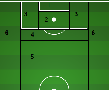
The first thing required would be a fair weighting of shots by location. To do that I took the ratio of the finishing rate by location and divided by the average finishing rate. Here is the resulting table for adjusting the value of shots.
| Location | Weighting |
| 1 | 3.14 |
| 2 | 1.79 |
| 3 | 0.72 |
| 4 | 0.54 |
| 5 | 0.24 |
For the sake of simplicity I have collapsed zones 5 & 6 into a fifth zone. This table illustrates that a shot from zone 1--inside the 6-yard box--is actually worth 3.14 average shots. And a shot from zone 5 is worth just .24 average shots. Adjusting all of the shots in MLS in 2013 yields the following result when attempting to predict table points.

You can tell from just eyeballing the dispersion of the data points that the location adjusted TSR better aligns with points and the Rsquared agrees. There is a 17-percent increase in R-squared. Not just pure volume of shots, but the location of those shots is vital to predicting points in MLS. It would be interesting to see if location is equally important in the EPL, where TSR is already such a strong predictor.
For the curious, the New York Red Bulls were the team that was best at getting better shots than their opponent. Their TSR improved from 47% to 52% when adjusting for shot location. Real Salt Lake actually took the biggest hit. Their TSR was 53% and their location-adjusted TSR dropped to 48%.
It's only one season's worth of data, but with such an impressive increase in the ability to explain the variance in point totals, it confirms that location does matter, and that teams are rewarded by taking better shots themselves while pushing their opponents -out farther from goal. And perhaps soccer analysts have another statistical toy to add to the toy box---Location-Adjusted Total Shot Ratio.