A little information on: PDO

With the holiday behind us we can once again start to return to the business at hand. The half-way mark is upon us and MLS has given us an exciting and very tight race across both the Western and Eastern conferences. With that comes another week of podcasts. #AnalysisEvolved. This week we plan on talking a bit about a statistic by the name PDO. Unlike how you might imagine most statistic names coming about, or things with three random letters, this is not an acronym. It's pronounced how it's sounds.

Originally a hockey metric, PDO is simply the sum of save percentage and scoring percentage, then multiplied times 1000. The rest of the history as it applies to soccer isn't necessarily important.

A great introduction to the idea and how it applies to the sport is given by Tyler Dellow of mc79hockey.com, and there is another introduction on the site Pension Plan Puppet by one "Skinny Fish."

Both sites give examples of how PDO can potentially isolate a team's performance over the course of a season and compare those to past performances, various incarnations of the team, and of course, other teams.

I can't directly attribute who was the first to apply the team analysis to the sport of soccer(Grayson confirmed he was the first...). But the oldest article I can find referencing its usage within the sport comes from the ever-smart and sophisticated Canuck, James Grayson. His series of introductions to the metric is linked below.

A Premier: PDO

PDO – part I

PDO – part II

Along with an explanation of the stat and some information about how it regresses to the mean---because it's fantastic at doing that---there is also a bit of information about how it can be used to compare different clubs to one another.

Basically, it comes down to being one of the best methods to determine the barometer of a team. While we can look at point totals and standings in the table, PDO can reasonably tell us if a team is over performing or under performing.

I'm not in any way an expert on this stat. There are of course some occasions were you may run into issues with trying to apply it to a specific scenario, and I could point anyone in search of more answers on the subject in better directions than toward myself. I could easily name about a dozen or so people that are much more versed in this metric than I am.

However, since we were going to take about it on our podcast this weekend, I wanted to give the reader/listener an opportunity to find some quick and easy references to the material before hearing us talk about it this weekend.

I'll have an updated PDO standings for you all tomorrow which will lead into our discussions on Saturday.

Possession Confusion Update

I wrote back in May about the paradoxical nature of OPTA's possession statistic in MLS---how more possession corresponds to better shot ratios, better shot ratios correspond to better goal differentials, but somehow more possession does not correspond to better goal differentials when we control for certain variables. In fact, I found that once I controlled for the teams playing in a given game, possession had a negative correlation with goal differential and winning. The new data agrees with the old. Correlations suggest that team possession still correlates positively with scoring attempts (p-value = 0.01), scoring attempts still correlate positively to goal differential (p-value = 0.02), and now with more data, possession is also positively correlated to goal differential (p-value = 0.01). That all seems to line up with logic, but the paradox from before still exists.

When I look game-by-game and control for the home and away teams, in-game possession has a positive correlation to shot ratio, but a negative correlation to goal differential. In other words, the team that has more possession in a given game tends to also earn more shot attempts, but still loses more frequently than we would expect. As mentioned in the first article back in May, this seems paradoxical. I had some theories in that article, but reader David Stringer got me to think about another logical explanation.

Teams that develop leads tend to sit back more defensively, and often are satisfied allowing the opponent to possess all it wants in less dangerous parts of the pitch. A team that has a lead in the second half probably  got that lead because it was generating more opportunities (read: attempts). It makes sense that the team that eventually went on to win also produced better shot ratios early on before getting the lead. After getting the lead, the team in front was willing to give up extreme possession relative to a more neutral shot rate. Thus it ends the game with poor possession, but a still favorable shot rate.

Just a theory, and I'd love to hear about other ideas! The stats are definitely not lying. These correlations are very real, but the causes for the possession paradox are still elusive.

ASA Podcast XI: The One Where We Talk Gold Cup XI And MLS Best XI

It's all about XI. We talk about Eddie Johnsons golden dome, run down the results of the US Open Cup (spoiler alert: Matty was 4/4 with his predictions) and then we cover the possible Gold Cup starting XI and then talk about our personal starting XI in the MLS. Enjoy! My apologies for not getting this sooner as I ran into a bit of hiccup yesterday. Hopefully that's behind me and we can press forth.

[audio http://americansocceranalysis.files.wordpress.com/2013/07/asa-episode-xi.mp3]

Introducing Shot Locations

On the site and on the podcast we have discussed shot rates an awful lot. A team’s shot rate is simply how many shots it has taken divided by how many shots it has conceded to its opponents. Whenever I make a Game-of the-Week prediction on the podcast, you’ll hear me use two primary pieces of information: which team is at home and which team has recorded the better shot rate. In general, shot rates help to explain not only the relative number of scoring opportunities a team has given itself, but also the relative number of scoring opportunities it is likely to get in the future. It’s predictive. There are, however, some conspicuous outliers in the league—teams that just don’t seem to follow the rules. Harrison wrote earlier this week about Montreal’s shot data. While Montreal gives up far more shots that it earns for itself, Harrison pointed out that Marco Di Vaio and company also place the ball quite well, finding the lower corners a high percentage of the time.

Perhaps Montreal’s own finishing rate is for real. But I won’t be convinced about the low rate at which teams have finished against Montreal before first delving into some new numbers. We have our own shot location data here at American Soccer Analysis, now, and I’m going to use it.

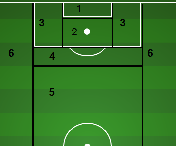
Scoring ZonesI have broken the field down into six primary scoring zones (seen to the right) in the hopes of accounting for the difficulty of both angle and distance.  It is possible that some teams earn a higher quality of opportunities rather than a higher quantity—or vice versa. In addition to recording where each team gets its own shots, I have also gathered the locations of the shots that each team has given up defensively from each zone. Here are some interesting tidbits about Montreal’s defense.

Despite being ahead much of the time—which would seemingly encourage low-quality attempts—Montreal still gives up a league-average proportion of shots from high-scoring zones one and two. In fact, if Montreal’s opponents had finished their attempts from zones one and two at the league average clip, Montreal would have given up six additional goals this season. However, including all six zones, Montreal would have given up just two additional goals due to some unlucky results from distance.

Because Montreal has played a wide range of opponents, it would make sense that its goal scoring rates against would stabilize to something close to league norms. It turns out, for the most part, that those rates have stabilized. The zones help to control for difficulty of shots, and Montreal’s defense isn’t getting particularly lucky based on the shots it is allowing. The major controversy still lies in the Impact’s offense, and whether or not it can sustain a league-leading finishing rate. According to its shot locations, the Impact "should have" scored eight fewer goals this season.

On the flip side we have Sporting Kansas City. Unlike Montreal, the Wiz have dominated the league all season in shot rates, and yet find themselves third in the East in points per match. Could quality of shots be playing a role?

Possibly. Sporting KC gets more shots from zones two and four than the league average team, and those tend to be decent scoring zones. SKC has outscored its opponents by five goals on the season, but with average finishing rates from each zone, one would expect a goal differential closer to +7 or +8. SKC has underachieved by only about two goals according to the shot locations data. How much of that difference is skill versus luck is still well beyond this blogger, but maybe someday...

*Own goals are taken out of the shot locations data.

Montreal Impact And Shot Placement

We like raw numbers around these parts. The lowest common denominator the better. But we like numbers in general, it's as if we are... kind of involved. There isn't much in the way of discrimination. You can take Numbers, and they can tell a story. Numbers can be just as biased as any news reporter or general fan too. They can also help give us insight to a specific question that we may have. A popular question around these parts is simply: why is Montreal so good? A club racing towards an opportunity for Supporting Shield. They sit 4th in the table with 26 points, two points behind the leading FC Dallas and have atleast two games in hand against all clubs above them in the standings. Obviously, they are in very good shape with a chance to run away this season with hardware. So how are they doing it?

Well, the one specific point of contention for us is their shooting. Currently the Impact are 5th in the league in shots on target per match and even further down the pipe at 14th with total shots attempted per match. So the question then becomes, how have they scored 1.69 goals a game, good for best in all of MLS?

They're shooting the lights out. Well, sort of. The ball is ending up in the back of the net at unusually high rates. Matthias and I have pretty much just summed this up to being  an irregularity, an outlier, and one that will eventually see the Impact coming back down to earth.

And yet, they haven't.

Montreal have the highest goal scoring rate in the league, yet have the same goal differential as the New England Revolution that sit 11th in the Supporter Shield table. 6 of their 8 wins have been by won by a single goal margin. Which tell us they've been strong in holding their leads.

It's obviously something that could and likely will involve a much further investigation as time permits. But I did formulate some interesting enough thoughts while digging through Whoscored.com and Squawka data.

Goal Locations

A good 80% of the goals are in high percentage conversation locations on the frame. Predominately low and presumably away from the keeper. You can see that trend continues with their overall shot selection.

shot locations

The majority of their shots are all, again, in great places with one third of the total shots in the lower half of the frame.

I'm not at this point sold that the Impact are going to come back down to earth with their conversion ratio. It's not so much that they are taking shots, but the type of shots they are taking. Marco Di Vaio is 36 and with that comes experience and intelligence.

He understands what he's doing. I believe that his effort to place high percentage shots is not only a skill; it's purposeful, and it's a game plan.

I'm not sure if they can continue to win in their +1 goal states, but their defence* has been very good thus far. It's possible, considering their current form, that they have a legit shot at the Supporter Shield at year's end.

Then again, we just may have to dig deeper into this.**

*Editor's note: Harrison is turning Redcoat on us.

**Editor's note: We will.

ASA Podcast: The One Where Harrison Was Gone

My apologies for the timeliness of the podcast being deployed. At the latest, I usually try to get it up by noon on Sunday. Of course, that didn't happen and you were subjected to my useless apologies that are as common as San Jose yellow cards. Anyway...  I spent the last week out among the gentle Dallas folk spending time with family. It was the last week that my wife's doctor permitted travel out of our local area (ya' know, she's preggers). Since I was out of pocket, Drew and Matthias picked up the responsibility for the podcast and did a great job. They talked US Mens National Team, finally finished up our review of the Eastern Conference standings, added some US Open Cup talk, and closed out the show previewing the Portland Timbers and LA Galaxy match later on this week.

Have a listen:

[audio http://americansocceranalysis.files.wordpress.com/2013/06/asa-episode-9.mp3]

Prediction versus Explanation

There is a subtle, yet very important, distinction between explanation and prediction in most sports, and Major League Soccer is no different. I don’t intend to make this long or particularly math heavy, so hang on. Here’s a simple example of what I’m talking about when I refer to explanation. In its first six games of the season, the Portland Timbers recorded 89 attempts and allowed just 57 to their opponents. During that same time, Portland scored ten goals while allowing eight. I might explain that the Timbers’ +2 goal differential was due—at least in part—to earning more offensive opportunities than their opponents.

Here’s another example, but this time in regards to prediction. In their first six games, the New England Revolution scored two goals while allowing six to its opponents. During its next six games, New England scored eight goals while allowing just three to its opponents. Using just New England as an example, it would seem as though goal scoring in the past (-4) poorly predicted goal scoring in the future (+5).

Of course, we have nineteen teams, not two, so I sorted through all nineteen teams looking for patterns. Here is what I found.

A team’s goal differential during its first six games explained its total points over that same time period extremely well (R2 was 77%). This is not surprising. Teams that tend to score more goals than their opponents also tend to win more games. Nothing shocking there.

However, a team’s goal differential in the first six games of the season provided no help in predicting its total points over the next six games. Here’s the plot on that one:

GD vs. Future Points - 6 weeks 2013

There is virtually no relationship between how well a team scored before, and then how many points it earned later. In other words, goal differentials are not predictive over six games.

But if you’re convinced the lack of predictive ability is completely due to a small sample size of twelve total games, check this out. A team’s attempts differential in its first six games shows a statistically significant correlation to both its future goal differential and points earned:

AD vs. GD and AD vs. Pts


Because it’s sports, prediction is never going to be precise, and these aren't perfect correlations at all. But I find it particularly impressive that over just twelve total games, the attempts data from a team’s first six games shows statistically significant predictive ability of the team’s results in the next six games.

If you’ve listened to our Game-of-the-Week section during our podcasts, you hear us talking a lot about shot ratios. This post hopefully clarified why we do that. Past shot ratios are better than past results at predicting future results.

Squawka Enters MLS Statistic Scene

So last week, ironically at about this exact time, I wrote about WhoScored entering the realm of American soccer and how awesome and exciting it was that they were going to start providing and publishing statistics for MLS---allowing us to skip the process of having to count up all the individual games, not to mention the time-consuming tables that Matty puts together. Now we have much of that information at our convenient disposal. Well we are getting even more spoiled as now Squawka joins the fray of MLS statistics.

If you haven't been to Squawka yet, you need to visit their site. It's not just a great collection of information, it's visually stimulating and helps put things into a context, helping to convey a message better than some writers, especially me, can convey.

This isn't just an awesome thing because it makes mine as well as my associates' lives easier. It's awesome because it's adding to what WhoScored does, not competing with them. This isn't FanGraphs vs. Baseball-Reference where you have similar but altogether different ways of arriving at thoughts and ideas that really confuse the hell out of you---like when you are trying to come up with whether or not Ricky Nolasco had a good season.

Sure there are some subtle differences between the two sites, and even how they end up rating a player. But this isn't about exact sciences at this point. It's more about making data prevalent. A big shout out goes to Nic English and his crew for getting this out there. Job well done.

Fun, or not so fun, Factoid of the Day

While digging through Wikipedia and various articles yesterday, I noticed the following. In 2010, after the expansion draft, DC United traded midfielder Fred Carreiro, allocation money and the #8 pick in the 2010 super draft to Philadelphia in return for goalkeeper, Troy Perkins. That #8 draft pick was used to draft Jack McInerney. Maybe you've heard of him. Keep that in mind when people mention the need for DC to find a goal scorer.