
A Guide to the ASA Vizhub
/What to know about the newest ASA platform
Have you ever wished that you could picture the game in front of you? Not as a broadcast, or a highlight video, but on a sheet of paper? All of a midfielder’s passes, your striker’s shots, an opponent’s tendencies, visualized? Previously, that required access to data, coding knowledge, and hours spent reinventing the wheel, just to see the most fundamental aspects of our game in graphic form. Not anymore.
Introducing American Soccer Analysis’ newest public platform: ASA VizHub. Making use of ASA’s extensive database, VizHub does the hard work for you, allowing for easy generation of industry-quality graphics.
Want to see Gareth Bale’s MLS Cup-winning goal in 2022? Easy. Curious about Sam Kerr’s player radar in 2019? No problem. What about Chivas USA’s defensive structure when playing with 4 defenders in the 2014 MLS season? Done. With over 20 unique templates and plenty of inputs, there are thousands of possible combinations to explore.
The best part? Just like the goals added (g+) tables, VizHub is free, easy to use, and up to date. You can access VizHub now at viz.americansocceranalysis.com, or at the Viz Hub tab at the top of the main site.
With the quantity of graphics at your fingertips, we thought it prudent to take a look at each and every chart available and give an explainer on what it all means. Keep reading to see the power of VizHub in action!
The Platform


The home page greets you with the kind face of A.J. Cochran, perpetual first-in-line-er. This page is where you can generate player-level graphics, which will be explained in depth later on in this article. For right now, let’s dive into how exactly the platform works.
On the left, you’ll see a series of league logos. Clicking on one of these will switch the active league — this applies to all tabs, not just the player tab. Clicking on the player search bar will let you browse every player in the given league, regardless of whether they’re still playing or not. When selecting a player, please allow a moment for the player's information to load in. Note the team logo in a blue box above the year dropdown: all teams the player played for in the selected season will appear here. In most cases, that’s just one team, but if two appear, you can easily toggle between them (or select both!) to view the player’s stats while playing for that team in that season. For example, if a player was traded mid-season, selecting just one team will filter the data to just that portion of the season.
The year and graphic dropdowns are fairly straightforward, and below them, the season/game toggle controls the quantity of data included in the graphic. While some charts are only available at the season level, many can be generated on a single-game basis, as well. To do that, simply switch to the “game” mode, and below, a dropdown with all of the player’s games in that season will appear.
It’s important to keep an eye on this area below the season/game toggle. Advanced options for charts will appear there depending on which graphic has been selected. Once all options are chosen, click “Go” to create your graphic!
The team tab is fairly similar to the player tab, with a few things missing. Note that there is no season/game toggle. As of right now, all team graphics are only available at the season level. Like before, simply select your season and team, choose your graphic, and hit “Go”! Again, advanced options for graphics will appear below the graphics dropdown, so keep an eye out for these extra controls.
The league tab is maybe the most straightforward; its function is to create league-wide scatterplots. More information will be shared regarding this function later on, but all you need to know is that the x- and y-variables are easy to change and will be reflected on the chart. You can change aesthetic options by clicking on the sliders to the right of the y-variable dropdown.
Now, for the specific graphics:
Player Graphics
Season- and game-level
All of the following charts can be generated both on an individual game and an entire season level.
The Shot Chart
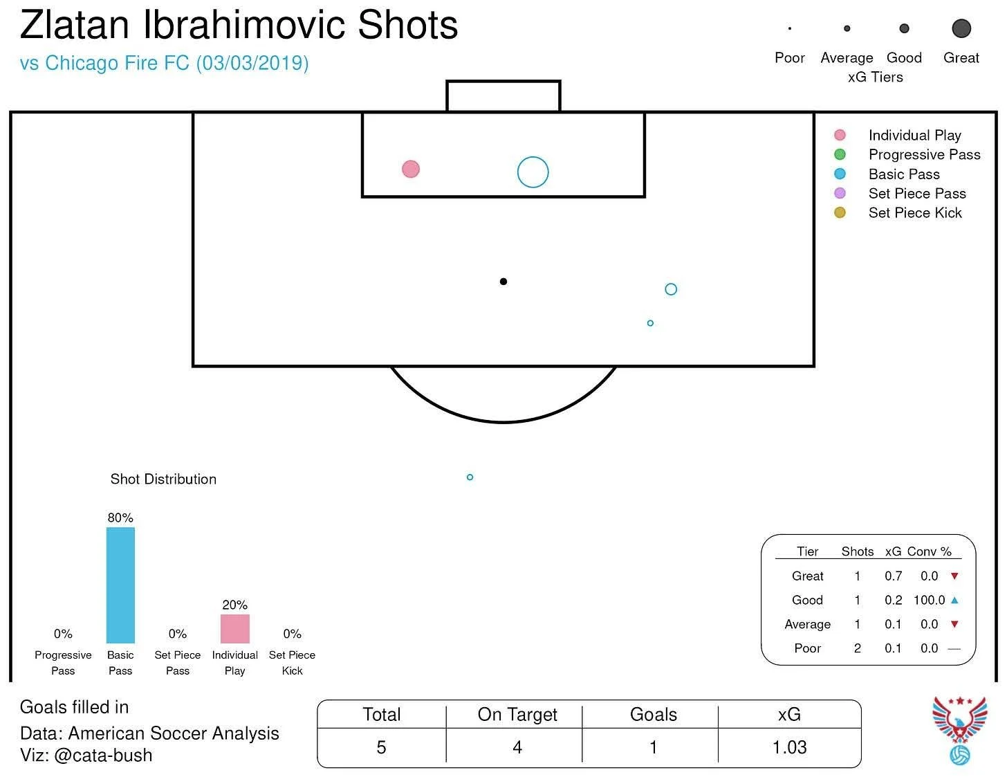
The player shot chart builds off of general shot map conventions by displaying shots as circles. Goals are filled in while all others are empty. The size of the circle is determined by the xG of the opportunity, while the color refers to the way in which that opportunity came about. The graphic relies heavily on the concepts introduced in Jamon Moore and Carlon Carpenter’s Where Goals Come From Project. For more info on xG tiers and shot patterns, you can read their original explainer here: Where Goals Come From.
The Pass Chart

The pass chart is even more straightforward. Each line represents a pass, with the destination indicated by a bubble. If the pass line and bubble are blue, then that pass is progressive, meaning it moved the ball 25+% closer to the goal and began in the attacking 60% of the pitch. The total count of attempted and completed passes is shown in the table below (incomplete passes are not plotted) alongside numbers showing how many passes were completed above/below expected and what the total passing g+ was for this player in the given match/season.
The Key Pass Chart
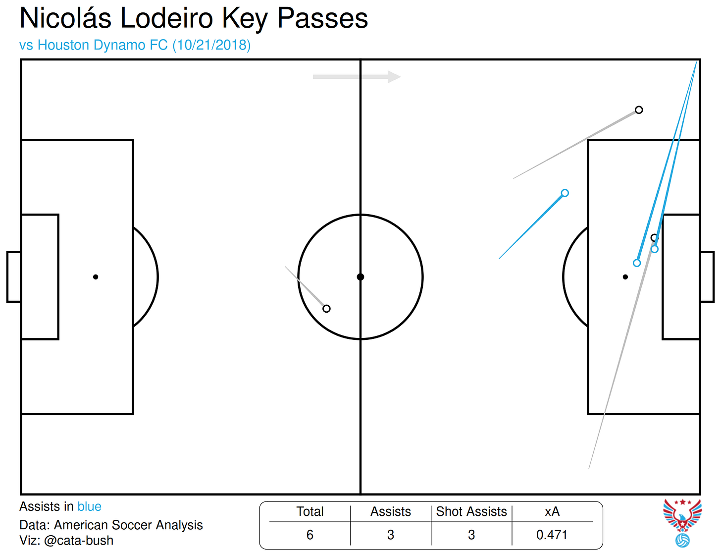
The key pass chart follows the guidelines explained above, with the caveat that passes highlighted in blue are no longer progressive, but rather represent primary assists. Every other pass shown in this graphic will have assisted a shot, but that shot will not have been a goal. The associated numbers and expected assists (xA) of these shots are shown in the table.
The Carry Chart
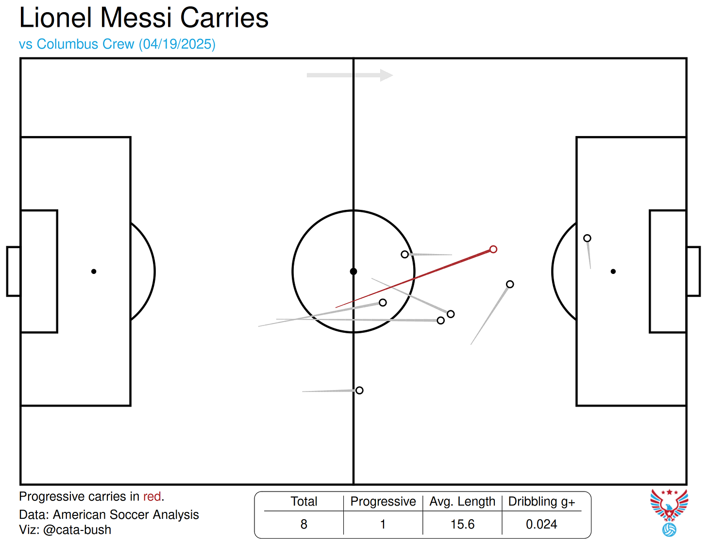
The carry chart is identical to the pass chart, but instead of displaying progression through passing, it shows how players traversed the field while on the ball. A red highlight indicates a progressive carry (using the same definition as above).
The Progressive Actions Chart

This plot combines the pass and carry charts and only shows such actions that progressed the ball 25+% closer to the goal and began in the attacking 60% of the pitch. The combined passing and dribbling g+ for the given player can be found in the table.
The Defensive Actions Chart

This plot is a little more unique. It shows each of the player’s successful defensive actions during a match, with each type of action having a unique identifier. The associated interrupting g+ values can be found in the table, broken down by category. Note: Interrupting g+ does incorporate unsuccessful actions, but they do not appear in the action plot.
The Heatmap/Touch Chart


The touch chart and heatmap display similar concepts in different ways; both show a player’s every touch, with the heatmap simply smoothing that to see their general positioning. Both contain the same table, showing the total number of touches, the player’s total g+ in that game, and the proportion of their touches that occurred in the defending half.
Season-level
The Passing Cluster Plot

This shows a player’s most common passing clusters throughout a season. The clusters include the pass’s origin, end location, and angle as parameters. For each cluster, some information is displayed: the average xPass (expected completion percentage), the average g+, and the percentage of the player’s passes that fall into this cluster.
The Passing Sonar

The passing sonar is based on Eliot McKinley’s work and shows how players are distributing the ball when they possess it. On the left, you’ll see three sonars (or fewer, if insufficient data is available) that pertain to the passes occurring specifically in that third of the pitch. The passer’s location in each pass is standardized to a central point, with the resulting pass angle grouped into polar bars. These are then plotted, with the outer bar indicating all attempted passes and the inner, filled bar indicating completed ones.
On the right, two heatmaps are shown that describe the origin and destination of passes played by the selected player. Beneath these plots, a table shows some key stats regarding their passing ability.
The Receiving Sonar
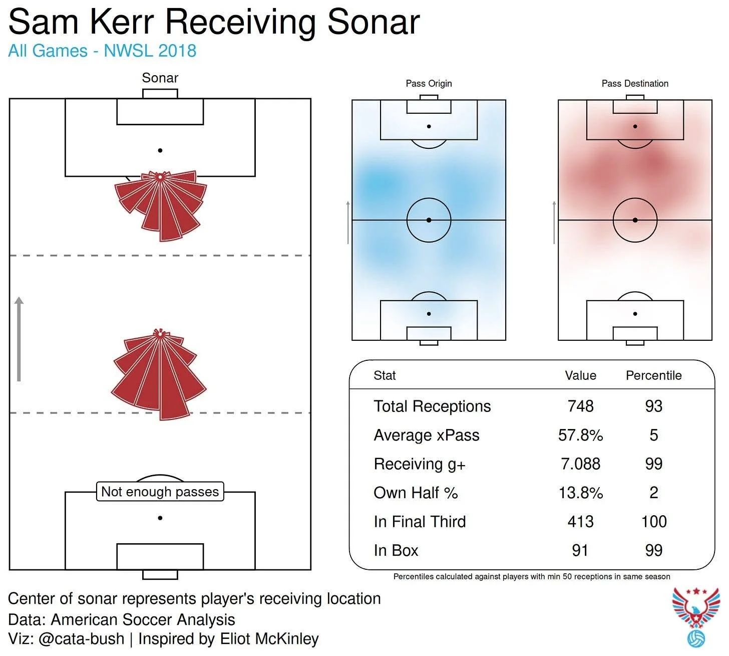
The receiving sonar is similar, though slightly different from the passing sonar. Instead of measuring the passes played by the selected player, it measures the passes received by the selected player. The principles remain the same, though, with the exception that “attempted receptions” do not exist, so the bars represent all received passes from that angle.
The Position Plot

This chart not only shows the positions in which the given player has played, but also displays how well that player performed when playing. The player’s goals added per 96 is converted to a color scale, with green representing high-quality performances and red indicating poor performances. The size of the circle represents the quantity of minutes played in that position, and grey circles show those positions where fewer than 96 minutes were played.
The Team Contribution Plot

The statistical team contribution plot shows how a player impacted their team across a season. There are three profiles to choose from: Attacking, Passing, and Defending. The attacking profile, for example, shows non-penalty expected goals (NPxG), non-penalty goals, xA, and assists. The y-axis indicates the player’s proportion of their team’s success in these categories. For example, if a player scored 8 non-penalty goals and their team scored 40 in total, then their contribution percentage in that category would be 20%. The dots highlighted in blue show this player’s contribution across all categories, while the grey dots represent all other players across all teams in the given season.
The Player Radar

The player radar is the most advanced of all player graphics. Incorporating traditional and innovative ways of displaying stats on polar axes, the player radar attempts to describe a player’s season-long performances across various categories. Each positional template represents a different set of stats by which to judge that player — by default, the positional profile is set to that player’s most common position; however, this can be easily changed. Additionally, the dot’s position on each axis is representative of how the player’s number in that category compares against their positional peers. That is to say, a FB is not compared to a ST, but rather only to other FBs across multiple years of data in the specified league. Stats are adjusted per 96 minutes unless otherwise noted.
Team Graphics
All of the team graphics are season-specific.
The Rolling NPxGD Chart

The rolling non-penalty expected goal differential (NPxGD) chart shows how a team has been performing offensively and defensively in the given season. The blue line indicates the team’s offensive xG, while the red line represents their xG conceded. An easy rule of thumb is: the more area in blue, the better. Those dotted lines at the beginning show the raw xGD values, but once five games of data have been reached, the 5-game rolling average can kick in, smoothing out wild fluctuations and helping us understand the team’s broader trends.
The Shot Heatmap

The team shot heatmap follows the same structure as the player shot chart, with one key difference. Instead of dots, the team shot chart has a heatmap, which helps with getting a better idea of where the team’s shots are coming from — a jumbled mess of circles isn’t always the most insightful. The same stats are there, though, including shot generation patterns, conversion rates by xG category, and more. If you can spy the little arrows on the side of the xG conversion rates, they’ll tell you if the team is scoring above or below expected for each xG tier.
The Passing Network

The classic passing network is reimagined a bit in VizHub. Instead of a game-level network with only starters, this passing network is grouped by formation, allowing for larger swaths of analysis. Each circle represents a position, with the number of passes played by the players in that position being reflected in the size of the node. The lines between nodes are sized similarly. Additionally, the location of the node is generated by finding the average location of all passes played by that position. Finally, the color of each node’s inner circle represents its passing g+, while the thin outer circle represents receiving g+.
The Progressive Passing Heatmap

The progressive passing heatmap has two options: Origin and Destination. This controls what part of the pass will be aggregated in the heatmap. In the table beneath the heatmap, a few stats are shown: firstly, the number of progressive passes per 100 total passes, secondly, the percentage of progressive passes that lead to shots, and lastly, the average progressive (or direct) distance of these progressive passes.
The Attacking Zone Action Plot
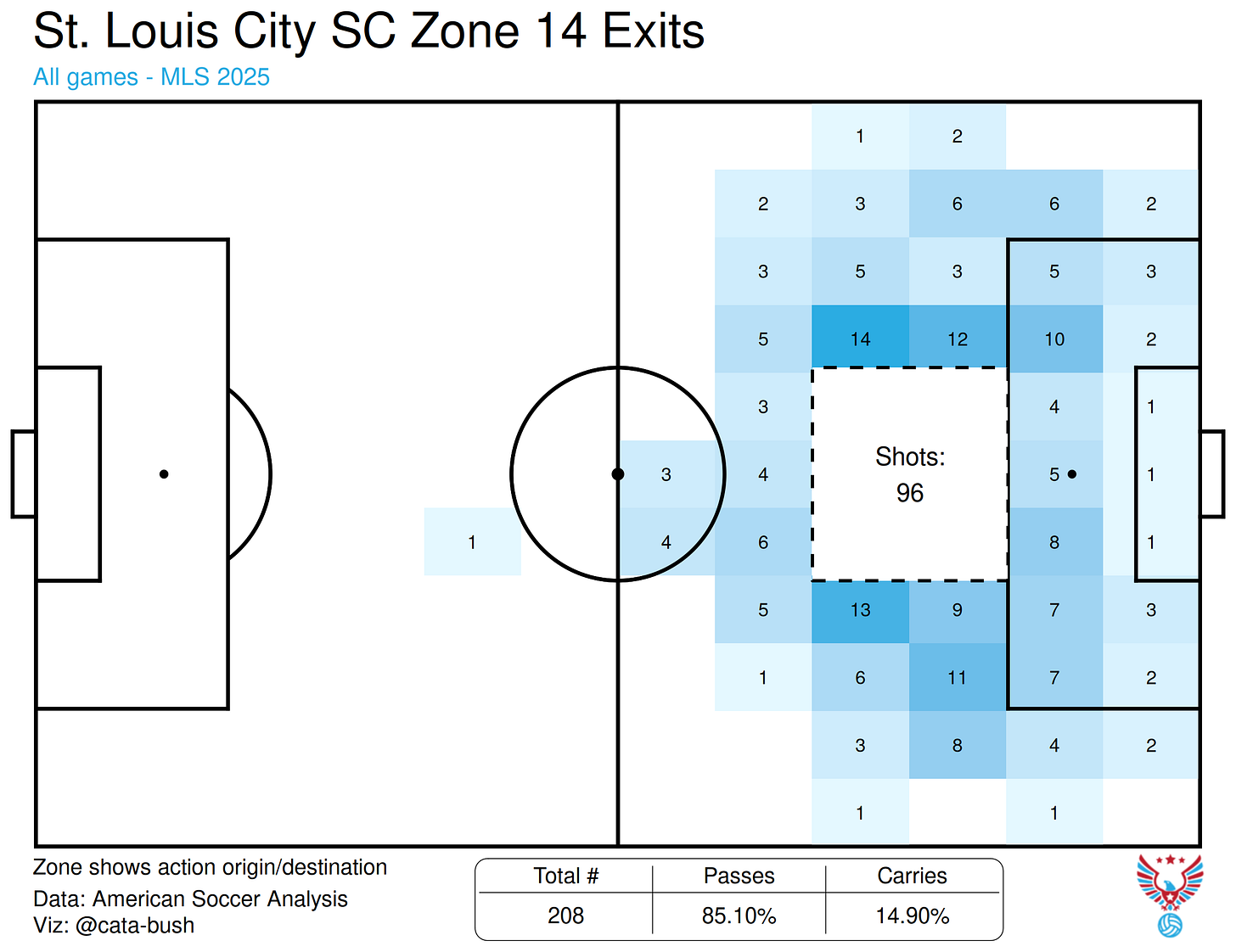
The attacking zone action plot aims to show how teams move in and out of dangerous areas. The three areas available for selection are Zone 14, the right half-space, and the left half-space. You can also select whether you’d like to see passes + carries into or out of said zone. The heatmap around the zone shows where the origins or destinations of those actions were located, respectively. The “out” option also displays the number of shots taken from the selected zone. In the table below, a breakdown of carries and passes by proportion of entries/exits is shown alongside the total number of actions.
The Defensive Structure Plot

This one is one of my favorites. The defensive structures give you an idea of how a team defends when playing with 3, 4, or 5 defenders at the back. For example, if a team plays a 4-2-3-1, 4-4-2, and 3-5-2 throughout a season, their time spent playing in a 4-2-3-1 and 4-4-2 will be grouped together under “4 defenders,” while the 3-5-2 will be separate. Once you’ve selected which type of formation you want to view, the defensive structure chart will generate for your selected team.
On the left, you’ll see those defenders plotted (I included LWB/RWB for 3-at-the-back formations, but note that not all 3 backs play with these positions) in their average defending positions — the mean location of all of their defensive actions. The color of each circle represents that player’s interrupting g+ above average; the line doesn’t mean anything, it’s just there to illustrate the “defensive line.” On the right, you’ll see a table of stats; this shows the team’s numbers while playing in the selected formation(s) compared against the rest of the league, regardless of formation. Below that, you’ll see a chart that shows offensive g+ conceded in the defending third by the given team. The number and opacity of each arrow indicate the percentile of the volume of offensive g+ conceded — so a lower number is better.
It’s a little complicated, but the beauty of this graphic is that you can compare across formations. For example, if you wanted to know whether a team had a better defense when playing with 3 defenders versus 4 defenders, these graphics could easily tell you that.
League Graphic
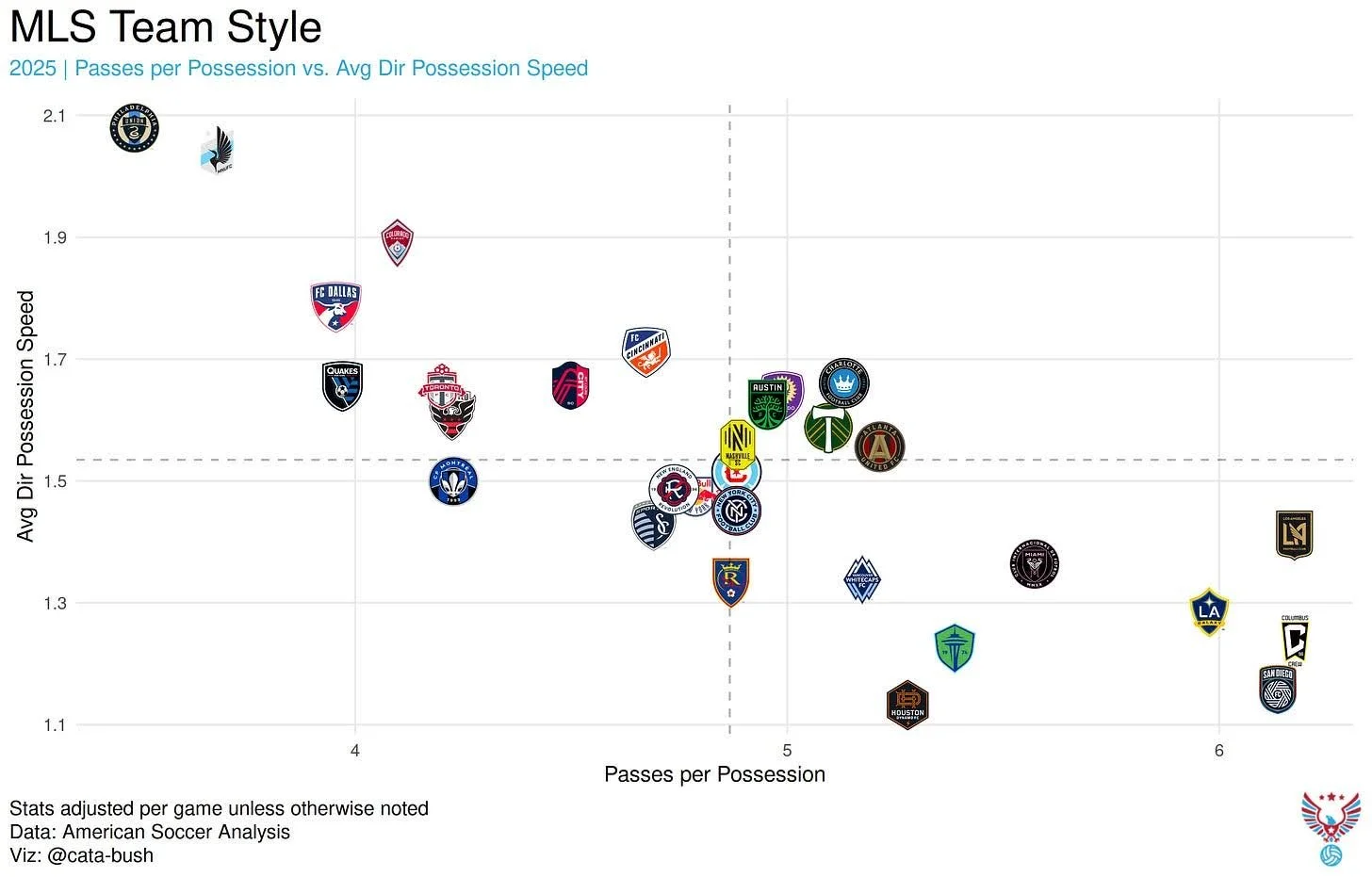
There is only one league graphic: a league-wide scatterplot showing every team and its respective set of stats.
The scatterplot has a wide range of stats that can be chosen for either the x- or y-axis. The list is as follows:
xG (for and against)
Goals (for and against)
Shots (for and against)
g+ (for and against)
Expected points per game (xPPG)
Average vertical distance of passes
Average height of defensive actions
Number of defensive actions
Number of completed passes
Field tilt (proportion of final third passes versus opponents’ final third passes)
Passes per defensive action (PPDA)
GK Launch % (percentage of GK’s passes that exceed 40 yards in length)
Passes per possession
Average direct possession speed
Each of the above stats is normalized per game unless otherwise noted.
Advanced options for the scatterplot include the ability to toggle on/off the average lines or the trend line.
That’s VizHub… for now! Keep in mind that this is just v1. More graphics and features will be coming in the future, so if you have ideas on what to add, don’t hesitate to reach out. You can contact me by emailing nwslstats22@gmail.com. If you run into issues using the app or think something looks off, please also email the above address with a detailed description of the issue you encountered.
For general ASA inquiries: inquiries@americansocceranalysis.com
For ASA consulting inquiries: consulting@americansocceranalysis.com
Let us know what you think of the app on Bluesky!